
How field research, behavioral design, and user testing helped shape a more accessible and motivating digital payment journey for smallholder farmers
myAgro helps smallholder farmers plan and invest in their farms through a layaway-style payment model. As it transitions toward a digital-first approach, the goal is to help all farmers, regardless of literacy level, complete more of their investment journey independently.
Today, most of a farmer’s payment journey runs through in-person visits from a Village Entrepreneur. VEs are trusted and effective, but one person can’t be in every household at the moment a farmer has cash on hand: after a market sale, when a remittance arrives, or right after the sale of their harvest. When those moments pass without support, farmers lose momentum toward the goals they set for their families and farms.
myAgro’s WhatsApp-based tool, “Agent in Your Pocket”, is part of a deliberate move to build a direct relationship with each farmer and give them the tools to manage their own payments. Growing use of WhatsApp and mobile money in farmers' communities opened the door to this direct relationship, and 'Agent in Your Pocket' is where myAgro put it into practice.
myAgro partnered with YUX to understand what would motivate farmers to keep progressing and to translate these insights into a behavior-driven UX strategy. Through field research, behavioral design, and user testing, YUX explored how nudges, progress tracking, and light gamification could encourage timely payments, strengthen engagement, and help farmers complete their investments more independently.

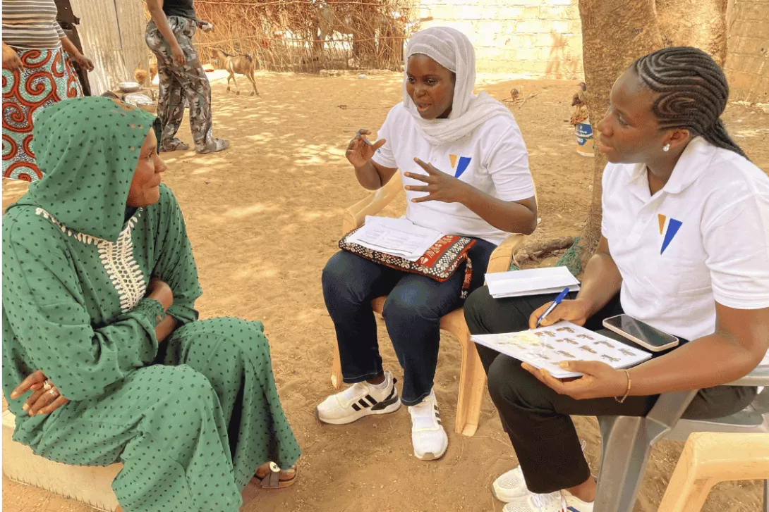
YUX researchers speaking with farmers during fieldwork in Thiès, Senegal.
1. Project Overview
Client: myAgro
Context: myAgro is transitioning toward a digital-first model to support smallholder farmers in planning and completing their agricultural investments independently. Farmers are increasingly using WhatsApp and mobile money, creating an opportunity to shift away from in-person-only follow-up toward more autonomous, scalable digital interactions.
Objective: Design a behavior-driven UX strategy for myAgro’s WhatsApp-based tool that reaches farmers at the moments they’re ready to act. The strategy should use nudging and gamification to help farmers keep progressing toward their goals on their own schedule, in a way that can grow beyond what in-person visits alone can support.
2. The challenge
myAgro’s model has been built on personal relationships: VEs visit farmers, remind them of their goals and collect payments. That trust is one of myAgro’s greatest strengths. But a model that depends on one-to-one visits has natural limits. A VE serves many farmers across a wide area, and a farmer’s best moment to pay rarely lines up with a scheduled visit. Cash comes in unpredictably and is often spent on other needs before anyone arrives to help turn it into progress toward the farmer’s investment.
To reach more farmers and support each one at the right time, myAgro built a digital payment journey on WhatsApp and mobile money. VEs stay central for building trust and giving hands-on help. Routine reminders, progress updates, and payments can happen digitally, so farmers can pay the moment they’re ready instead of waiting for a visit.
Going digital raised a question of its own: how do you onboard and engage farmers whose literacy and comfort with phones vary widely? Reading ability and familiarity with WhatsApp both create friction, and some farmers still rely on VEs, the Call Center, or family members to get a payment through.
So the task was not to digitize the existing reminders. It was to find out what helps farmers stay motivated between visits and to design a journey timed to when farmers actually have money, one that a farmer who couldn’t read easily or had never paid without a VE present would still trust and use.
That is where YUX came in. We were engaged to answer the behavioral question and turn it into design direction: how payment nudges (WhatsApp reminders) and gamification (visual cues that show progress) should be tailored to myAgro’s farmers, and what those features need to do for a farmer with low literacy or low digital confidence. Our work ended with those findings and recommendations. myAgro’s team would build and deploy them inside its payment system to help more farmers reach their investment goals independently.
3. Our approach
We structured the work as a sequence of research, synthesis, behavioral design, and validation. The goal was to make each design decision traceable back to something observed in the field.
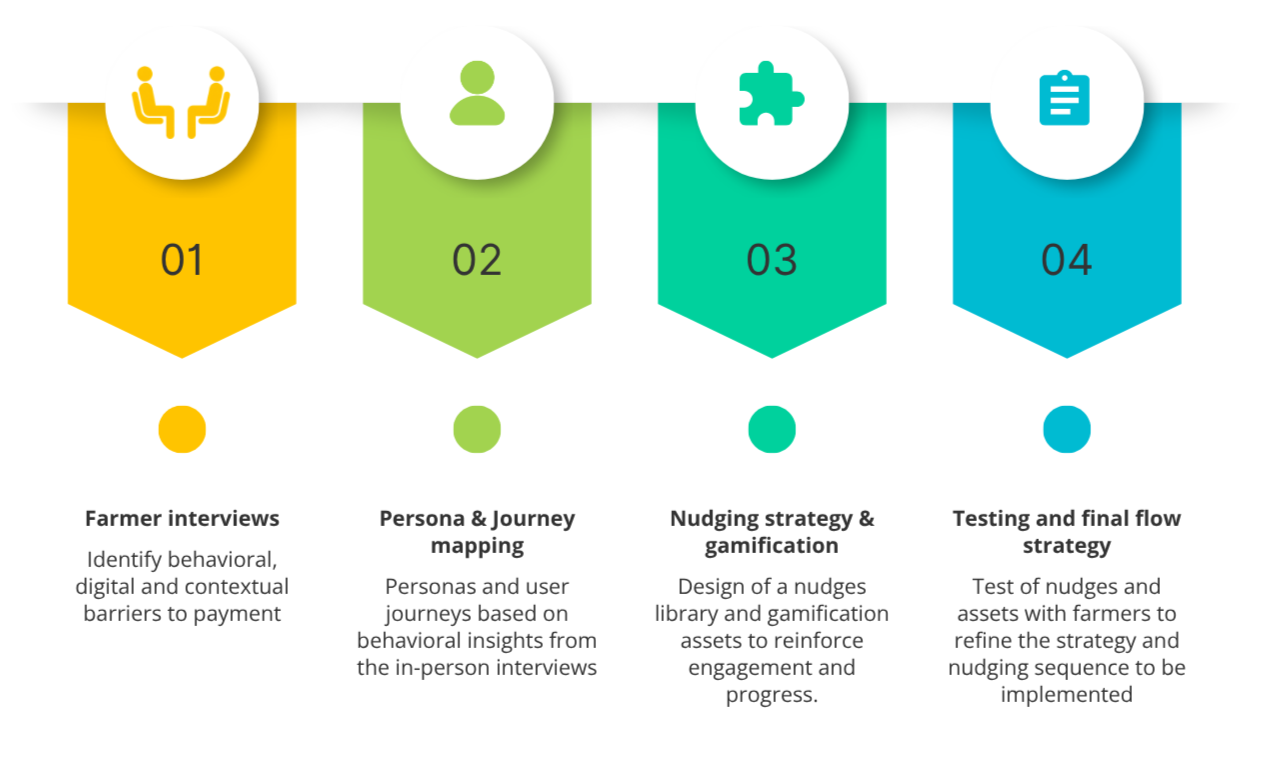
The project followed a four-step methodology, moving from field research to a tested, ready-to-implement nudging strategy:
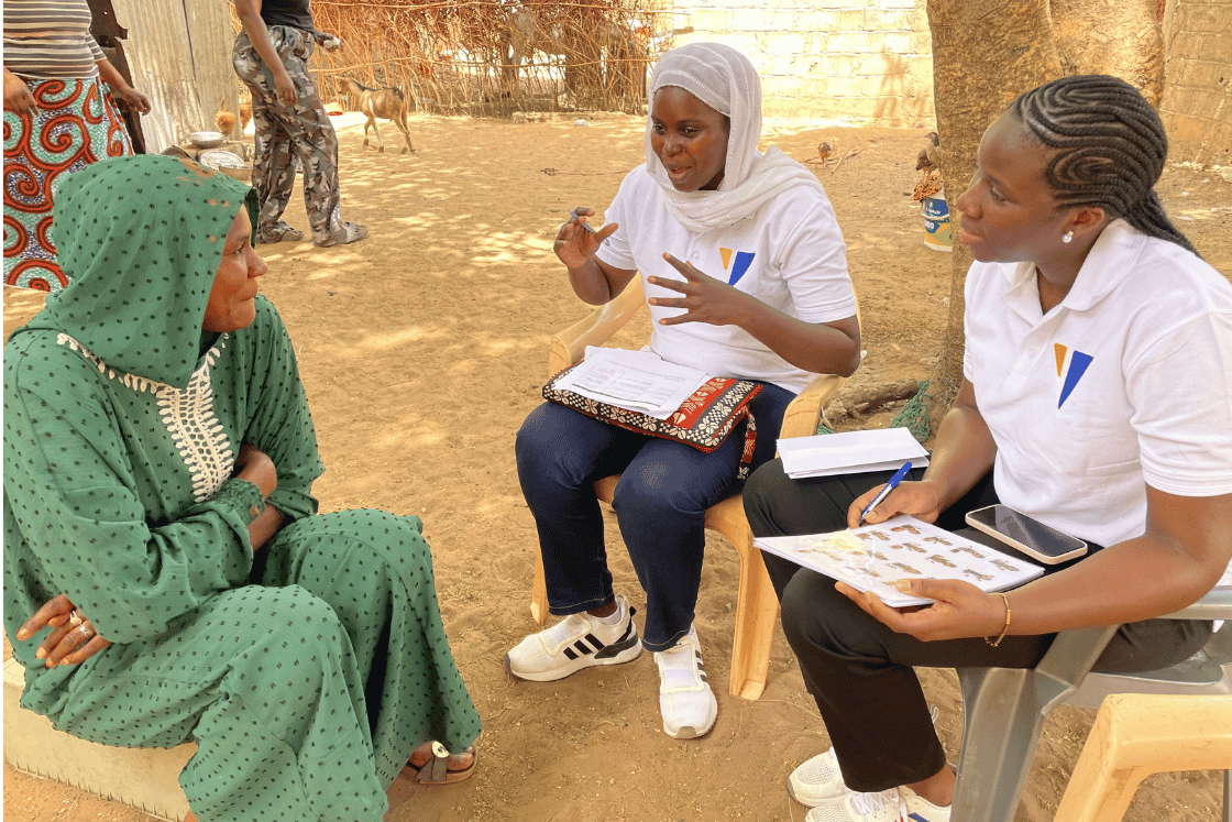
YUX researchers speaking with a farmer to understand challenges with the existing payment journey.
The personas helped us resist designing for a single “average” farmer. The research instead surfaced a spectrum: from digitally confident family members who often help others transact, to farmers who rely strongly on VEs, voice guidance or family support to navigate payments.
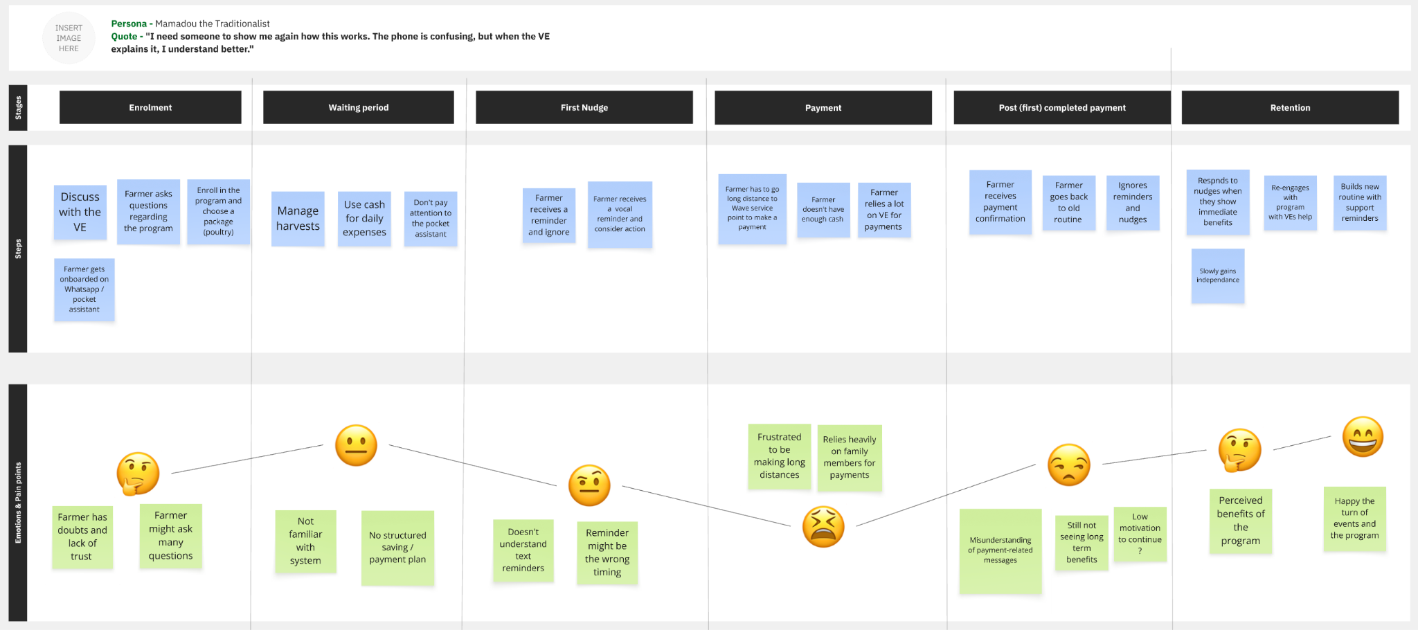
Journey mapping helped connect farmer actions, emotional highs and lows, and opportunities for support across the payment journey.
4. What we learned from farmers
The strongest finding was that digital autonomy did not mean removing human trust. Farmers’ hopes for easier digital payments sat alongside a strong reliance on people they already knew and trusted. VEs and the Call Center remained important sources of reassurance, especially for farmers with less digital confidence. Digital tools don’t replace VEs; they free VEs to focus on the farmers and moments where a personal visit matters most.
Voice could be more useful than text
Reading ability and language were significant parts of the experience. Farmers often preferred voice messages because they could understand instructions without needing someone else to read or interpret them.
Timing matters as much as persuasion
A reminder cannot solve a liquidity problem. Farmers told us that messages sent when cash was unavailable could feel like pressure rather than support.
5. Turning insights into design
Instead of writing a fixed series of reminder messages, we developed a flexible nudging framework that could be adapted to different moments in a farmer’s journey. Each nudge combined three dimensions: behavioral intent, tone of delivery, and message framing.
This created room to vary messages according to context while maintaining a coherent strategy. Rather than escalating immediately to stronger language, the proposed flow moves progressively from support and motivation to reminders and progress reinforcement, and finally to greater urgency when appropriate..
Gamification was designed to work alongside this strategy by making progress visible through simple, culturally relevant cues. We explored progress indicators and milestone stickers, as well as different character concepts, including animals such as a lion and squirrel. We also explored human-centered visuals that could reinforce the feeling of moving toward a concrete goal.
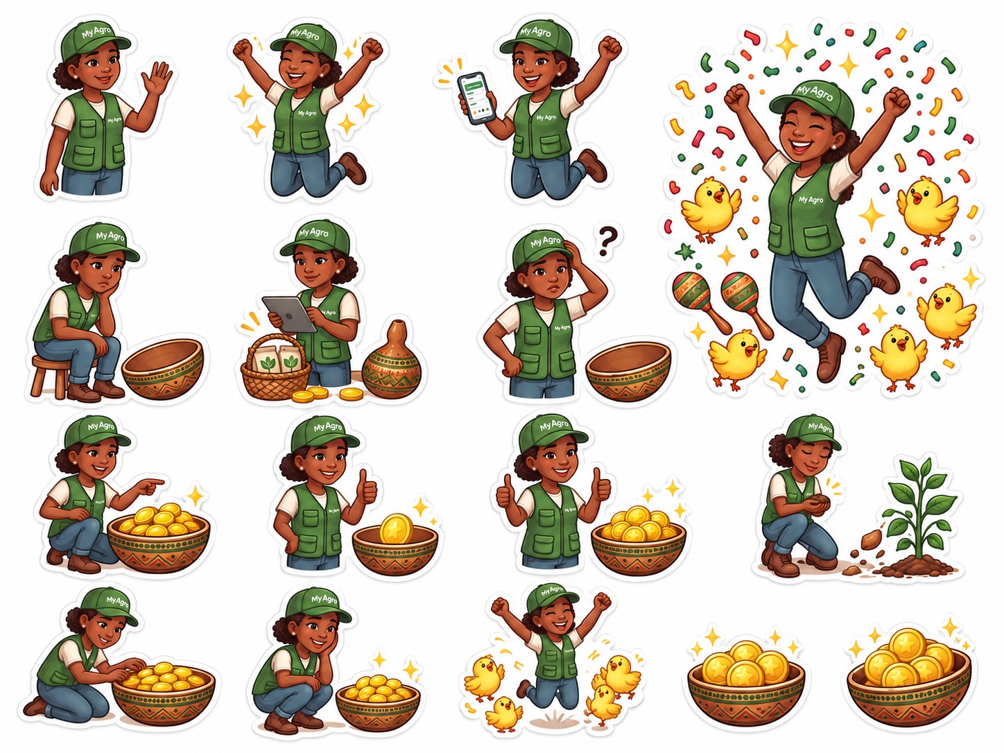
Human-centered sticker concepts explored during the gamification work.
The resulting user flows covered key moments such as early drop-off after onboarding, periods of payment inactivity, halfway progress, and near-completion. Importantly, the flows also allowed for human handoff when automated nudges were no longer the right form of support.
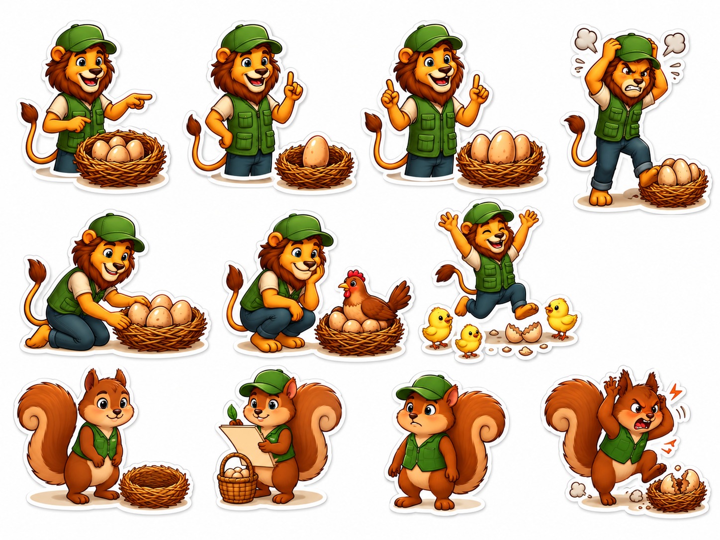
Lion and squirrel character concepts explored during the gamification design process.
6. Testing and iteration
We tested the proposed experience with eight farmers representing different payment experiences and support needs. Sessions focused on whether farmers understood the flow, how they reacted to different reminder approaches, and whether the visuals and formats made the experience easier to use.
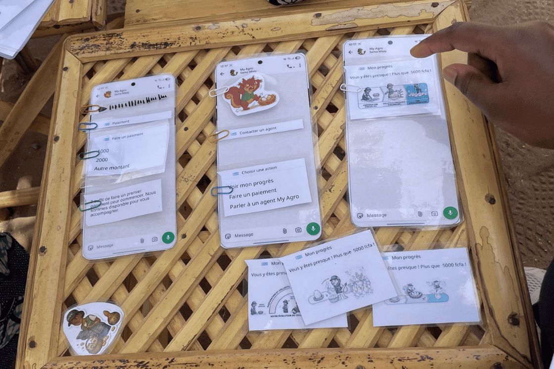
Low-fidelity WhatsApp flows and visual concepts used during farmer testing.
The testing sharpened several decisions. Voice messages were consistently easier to understand than text-heavy communication. Farmers didn’t always distinguish subtle tone variations, but they preferred warmer, more encouraging reminders over harsh or overly directive language. Human stickers were more relatable than the animal mascot, and visual milestones helped make progress easier to grasp at a glance.
These findings led us to refine both the interaction format and the sequencing of messages. The final strategy places greater emphasis on audio, supportive language, visible progress, and deliberate spacing between nudges, while keeping a route back to human support when needed.
7. The final solution
The project concluded with a research-informed UX direction for myAgro to build on, including a structured nudging approach, gamification principles, and prioritized user-flow recommendations for implementation. The work was intentionally designed as a framework that myAgro can continue to adapt and test, rather than a rigid set of messages or screens.
To respect the operational nature of the work, this case study does not reproduce the full nudge library, detailed trigger conditions, or implementation logic. The central design principle, however, is simple: make digital support understandable, motivating and context-aware, while preserving access to human help where it adds the most value.
8. Impact / what the solution enables
At this stage, the value of the work is best understood in terms of what it enables rather than as a claim of post-launch impact. The framework gives myAgro a clearer foundation for building and evaluating a more accessible digital payment journey, one that can support farmer independence while remaining sensitive to language, literacy, liquidity, and trust.
It also creates a basis for ongoing optimization: testing different forms of communication, learning from behavioral data and field feedback, and evolving the experience as farmers’ needs change. Any future performance results would need to be validated after implementation before being reported publicly.
9. Key takeaway
The clearest lesson from this project is that digital transformation for low-literacy, low-connectivity users succeeds when it is built around human trust cues, not despite them. Farmers were open to a digital assistant, but only when it sounded, looked, and behaved like someone they already trusted: a warm voice in their own language, a human character rather than an abstract mascot, and a real person to fall back on when the automation reaches its limit.
Structuring nudges as a combination of intent, tone, and framing gave the team a way to design deliberately rather than by instinct. Running usability tests directly with farmers, rather than assuming what would work, provided myAgro with a strong foundation to build on for continued testing and iteration.
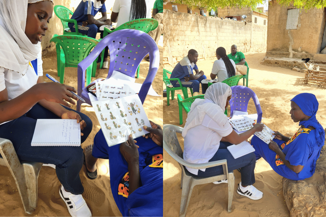
A YUX researcher and myAgro team member conducting a user test in Thiès, Senegal.
This nudging strategy UX framework was developed by YUX for myAgro, Senegal, May 2026.