YUX goes back on the Human Centered Design project carried last July for the UN Capital Development Fund (UNCDF) and the World Food Programme (WFP) in partnership with the digital finance consulting firm Amarante. The aim of such a study was to increase the user experience of a digital marketplace — Maano — that connects farmers and buyers in Zambia.
This article summarizes the human centered design approach, and the findings that can guide the design of digital services for agriculture by financial providers and fintechs that cater to similar markets in Africa.
The Zambian agriculture sector accounts for 19 percent of the country’s GDP and employs close to 16 million people, about three quarters of the population as a report from the World Bank states. Zambia was one of the first in Africa to adopt digital financial services with the launch of Zap by Celpay in 2002. Recently, there has been a surge in the number of digital finance products and users in the country as well as an emerging fintech industry.

As confirmed by an earlier WFP project, most farmers in Zambia are smallholders who lack the means to access and participate in markets. Their limited ability to access information about additional markets outside their immediate community makes them effectively invisible to other traders who may be willing to pay them a better price for their crops. This invisibility limits their bargaining power and diminishes their ability to diversify into markets that could potentially lift them out of hunger and poverty.
In response to this need of farmers to gain improved access markets, WFP launched an ambitious start-up in May 2017: Maano, a virtual farmers’ market that aims to help rural smallholder farmers sell their produce at more equitable prices by providing them a transparent, open and trustworthy platform to advertise, negotiate fair prices and sell their produce. As WFP explains, “[its] platform supports smallholder farmers organized by lead farmers (Ambassadors), to estimate their community’s production, [agree on a] selling price, and advertise this information on the online market.”
Initially, Maano, which means intelligence in the local language Tonga, was piloted with 46 farmers acting as Ambassadors for the app. By the end of its first year, the app supported 1,200 rural smallholders to sell almost 3,000 bags (150 kg each) of their crops for more than ZMW 450,000 (US$44,064). In 2018, the project scaled up from 1 to 4 districts and went from 50 to 114 Ambassadors and a total of 6,600 bags of crops worth more than ZMW 1,225,000 (US$120,000) have been sold. Many farmers have reported that they would not have been able to sell their goods at all, or at a much lower price, without Maano.
Challenges in designing an ‘agritech’ solution
Although the app was a hit among the farmers, who went from having limited access to markets to being able to increase their visibility and profitability, a post-pilot user interface and user experience (UI/UX) assessment highlighted several challenges the farmers faced while using the app. These challenges are highlighted below in order of hierarchy:
- Icons that were easily misinterpreted or misunderstood by the farmers.
- Language and scenarios that were too complicated to follow, resulting in long learning times for the farmers.
- Profile access restrictions that limited users’ ability to buy and sell simultaneously.
- Lack of key additional features, such as weather and transport information that limited the app’s usefulness.
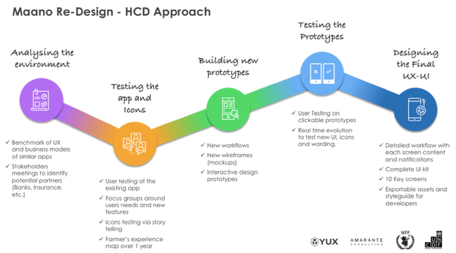
To help address these challenges, WFP requested the support of UNCDF, who had demonstrated strong experience in working with private sector players in introducing human-centered design into the Zambian market. UNCDF, worked with Amarante and YUX with the aim of improving the user experience of the app and enriching the Maano ecosystem with high-value services dedicated to farmers. The partners applied a human-centered design approach to gather qualitative feedback on existing and potential app features, test prototypes and create a more robust user experience and user interface (see the figure).

Key insights for agriculture and fintech apps
Iconography: One elephant, different perspectives
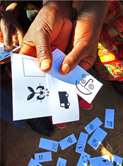
One of the most striking insights to come to light was the difference in understanding of icons. Several tests asked users to explain what they thought each printed pictogram represented. When shown a picture of a hand putting fertilizer on a crop, it did not make sense to the farmers since they know to put fertilizer under crops, not on top of them. When shown a picture of a dollar note, which was meant to represent money or payment, all the farmers interpreted the icon to be a smartphone in a person’s hand. When shown icons that are traditionally used in mobile apps, like the ‘burger menu — the ‘burger menu’ has three parallel lines and typically appears in the top corner of a graphical user interface — the filter icon and the notification icon, none of the farmers knew what they meant.

The lesson the research team learned is that, when it comes to icons, farmers look at the details of the icon itself rather than think of the concept it is meant to portray. Consequently, for the icons in the new version of the Maano app, all of them were tested and adjusted to ensure that the farmers know exactly what they are meant to portray.
Digital Dialect not spoken here: Keep it simple
To ‘digital natives,’ words like delete, login and edit have become ingrained in their dialect; it may be easy for them to forget that, to people who have never used a smartphone before, these words are essentially meaningless. This was exactly the case for the farmers using the Maano app, even among those who spoke and understood some English. As with the icons, the research team tested the words used in the app to determine which words were understood by the farmers and which needed to be simplified or removed.
During the first year, Maano Ambassadors attended training camps at the Ministry of Agriculture’s facilities that lasted up to two weeks. They were taught to use a smart phone and the Maano app, along with other necessary applications. While training on the app is necessary, it may not have to be a time-intensive investment. Training time and cost is not only a constraint to scaling-up Maano, but also has serious cost implications, particularly for the Ambassadors — both in terms of traveling and the opportunity cost of time spent while training. Making the Maano app easier to understand, by making the UI more intuitive to use, could greatly reduce the cost of training and speed up the scale-up plans.
Farmers want to buy and sell: Don’t put them in a box
Another key insight that emerged during the redesign process was the fact that several farmers also wanted to be able to buy on the platform, notably fertilizers and seeds. For rural farmers, these products are often expensive and hard to source nearby. Similarly, several buyers also wanted the option to sell, including to larger buyers. Users preferred some flexibility in terms of what profile they could assume on the app. Integrating this new feature, without damaging the app’s usability, will be crucial for the company’s growth and business model because it can help drive active usage of the app all year long.
Data and value-added services: Farmers are hooked & want more

While the Maano app was designed to function as a virtual marketplace, discussions with the farmers revealed other challenges in their daily lives. These discoveries helped generate ideas for potential features that could be included in the app. Some were added in the prototypes and tested directly, while others were just discussed with the farmers to assess their reactions. In the end, the additional services fell into four categories: weather forecast and advice, market prices, financial services and farming advice (see the screenshot).
The team also explained to users that the more they use the app, the more data will be generated about their activities, which will in turn enable them to access tailored, high-value services like digital loans, saving accounts, crop insurance, etc. Designing and implementing such services will drive user growth and retention.
Human-centered design and an iterative development process were both crucial to ensuring that the recommendations that emerged will help Maano meet the needs and address the capabilities of Zambian farmers. With the validity and applicability of the recommended changes already tested through in-field prototyping, WFP will turn next to piloting and scaling up the user interface and feature upgrades before the next farming/trading season.

Lessons learned from this project shed light on how smallholders interact with mobile apps and other technology-driven innovations. Tailoring the User Interface to suit the needs and capabilities of farmers will help make such innovations more accessible and bridge the widening urban/rural technology gap. The subsequent changes will make the app more engaging, easier to navigate, understand and adapt to — ultimately driving Maano’s usage and transactional growth. With a target of providing market access to more than 5,000 farmers and facilitating trade of more than 300 metric tons of pulses in 2019 alone and eventually reach up to 25,000 farmers over the next 3 years, the Maano team is confident that its ambitious targets and growth trajectory will be achieved once the features and changes to the user interface are implemented.


