

Lessons from the UX/UI phase of an evolving digital mental health platform.
Mental health platforms operate in a particularly sensitive design space. The language used, the way support is presented, and even seemingly small interface decisions can influence whether a user feels reassured, confused, or discouraged from seeking help.
As part of the Agence Nationale de la Recherche (ANR) project on the mental health of university students in Africa, YUX brought its user research and design expertise to the development of Mama Africa Campus, a digital platform intended to promote and destigmatize mental health, support students in accessing the right support pathways, and help them find support in cases of emotional distress.
Our role focused on transforming research findings and emerging service concepts into a digital experience that students could understand, navigate, and use with greater confidence.
YUX's UX and UI work has been completed, and the platform has since progressed into development. This case study focuses on the research, UX/UI design, prototyping, and usability testing completed during our engagement.
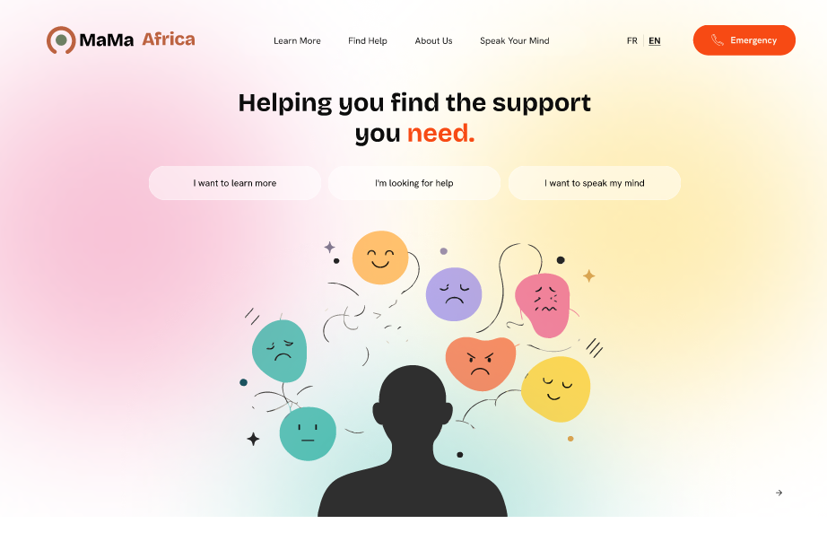
Prototype homepage used to test how students might navigate Mama Africa Campus and identify the support they need.
1. Project Overview
Project: Mama Africa Campus
Client / Research Partners : ANR, IRD, CHCP, and CNRS
Context: Mama Africa Campus grew out of the wider Mama Africa research project, which investigates the prevalence of common mental disorders (CMDs) among university students, as well as the barriers that can make accessing mental health information, care, and support more difficult across African universities. Spanning Senegal, Cameroon, the Democratic Republic of Congo, Algeria, and Ghana, the initiative brings together expertise from disciplines including sociology, anthropology, statistics, psychology, and psychiatry to understand student mental health beyond a purely clinical perspective. The research combines quantitative and qualitative approaches to explore students' experiences, the pressures they face, the environments around them, and the factors that may encourage or prevent them from seeking help.
Objective: Translate insights from the Mama_ Africa research project into the UX and UI of Mama Africa Campus - a digital platform designed to promote and destigmatize mental health, support students in accessing the right support pathways and find help in case of emotional distress within their local context. YUX's work focused on shaping the user experience, prototyping and testing the platform to ensure that sensitive mental -health information could be presented in a way that was clear, accessible and supportive for students.
2. The Challenge
As the research progressed, it highlighted an important gap: students experiencing stress, anxiety and other emotional issues did not always know where to find relevant information or where they could seek support.
This challenge is further shaped by the stigma that still surrounds mental disorders. Worries about judgement, being identified and labelled when seeking help may make it harder for some students to speak openly about their experiences and, ultimately, seek support. This created a strong need for the digital experience to offer a sense of privacy and anonymity, particularly when students are exploring sensitive information or expressing their feelings.
Engaging students in a research initiative around their mental health and lived experiences raised a major ethical consideration for the Mama Africa team: how could the project move beyond documenting these experiences and contribute something useful to the students and communities involved?
This consideration helped shape the evolution of the Mama_Africa project into Mama Africa Campus, transforming research findings into a practical digital resource. The challenge was to design an experience around two core needs: making mental health information relevant to university students in Africa available and easier to understand, and helping students navigate available support options while creating an environment in which they could feel safe engaging with sensitive content.
Given the sensitive nature of the topic, the platform also had to communicate mental health information carefully - using clear and accessible language without labelling students, implying a diagnosis or positioning the platform as a substitute for professional care.
The challenge, therefore, was to translate the results of a multidisciplinary research project into a student-centred digital experience.
3. Our Approach: Prototyping and Testing the Student Experience
YUX’s role focused on designing the first UX/UI prototypes and testing them with students at the study sites to understand how well the proposed experience worked in practice.
The Mama_Africa team led the development of the content and had already created an initial sitemap outlining how information and resources could be structured across the platform. YUX used this foundation to develop early prototypes and explore how students would navigate the proposed structure, interact with key features and access the information and support pathways presented.
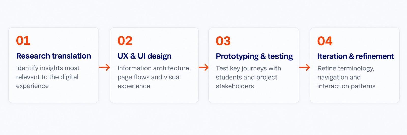
The four connected stages of YUX’s UX/UI process, from research translation through to iteration and refinement.
The work moved through four connected stages:
- Research translation and experience definition: Working closely with the Mama_Africa team to identify the research insights most relevant to the digital experience. These discussions highlighted several priorities for the platform, including the need for anonymity, the limited availability of existing mental health resources, the importance of content that reflects African perceptions and experiences of mental health, and the need to make available support services easier for students to identify and access.
- UX and UI design: Developing the information architecture, page flows and visual experience around the platform’s core content and support pathways.
- Prototyping and usability testing: Testing key journeys with intended users and relevant project stakeholders to identify areas of confusion, misinterpretation, friction or uncertainty.
- Iteration and design refinement: Using feedback from testing to refine terminology, navigation, information hierarchy and interaction patterns before development.
Usability testing covered several important journeys, including accessing mental health information, exploring support resources, reviewing information related to distress, understanding options for speaking with a counsellor and engaging with a feature designed to help get rid of unsettling and difficult emotional experiences.
4. Testing the Experience Before Development
Usability testing was used to understand how participants interpreted and interacted with the platform before it moved into development.
The sessions explored not only whether participants could navigate the prototype, but also whether the language, labels and interaction patterns communicated what the team intended.
Some elements of the experience were understood easily. Participants were generally able to locate mental health information, found the resources presented useful and responded positively to the overall visual direction of the prototype.
Testing also surfaced areas that required further refinement. These ranged from relatively small interaction cues to more important questions about terminology, content hierarchy and how different support options were described.
One feature tested was the “Black Box,” an idea introduced by the Mama Africa team as a highly private and ephemeral journaling space for students. It provided a space where they could write about what they were experiencing and get things off their chest. The feature was not originally intended to provide counselling or generate a response; its purpose was to provide students with a confidential space to help process unsettling and difficult emotional experiences without requiring what they shared to be permanently retained.
Testing showed, however, that this intention was not always immediately clear to participants. Some users interpreted the feature differently or expected some form of response after sharing their experiences. This highlighted the need to further refine the concept and make its purpose, anonymity and confidentiality clearer within the experience.
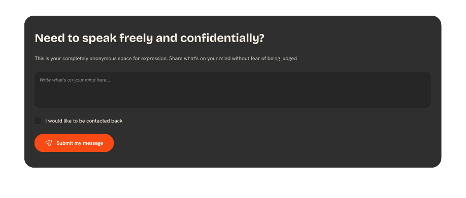
The “Black Box” feature tested with students - a confidential space to put difficult experiences into words.
The purpose of this phase was therefore not to demonstrate the effectiveness of a deployed product, but to identify and address potential usability issues before the platform entered its development phase.
5. What We Learned Through Usability Testing
Mental-health language needed to be easier to recognise
One of the clearest findings concerned terminology.
Some of the early content relied on language that participants found technical or difficult to immediately connect with their own experiences. Since much of the content originated from an academic research setting, some of the language naturally adopted a more formal and clinical tone than students typically use.
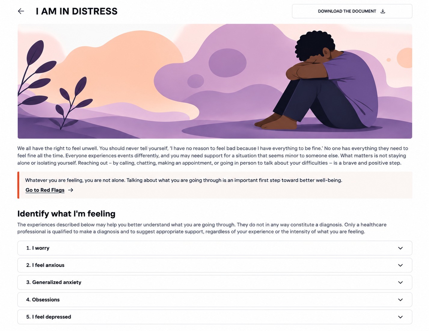
An early version of the “I am struggling” article, where clinical wording made it harder for students to recognise their own experience.
Medical terminology could also shape how certain information was interpreted, particularly when students encountered the names of specific mental-health conditions.
This led the team to explore more accessible ways of presenting the content, including describing experiences through recognisable statements and feelings rather than asking students to begin from the name of a condition.
The distinction was important: the platform was being designed as an information and navigation resource, not as a diagnostic tool.
Interaction cues needed to be more explicit
Testing also showed that interactions that appeared intuitive during design were not necessarily interpreted in the same way by participants.
For example, some users did not immediately understand that certain pieces of content could be opened to reveal additional information. This resulted in recommendations for clearer instructions, stronger visual cues and adjustments to the presentation of information.
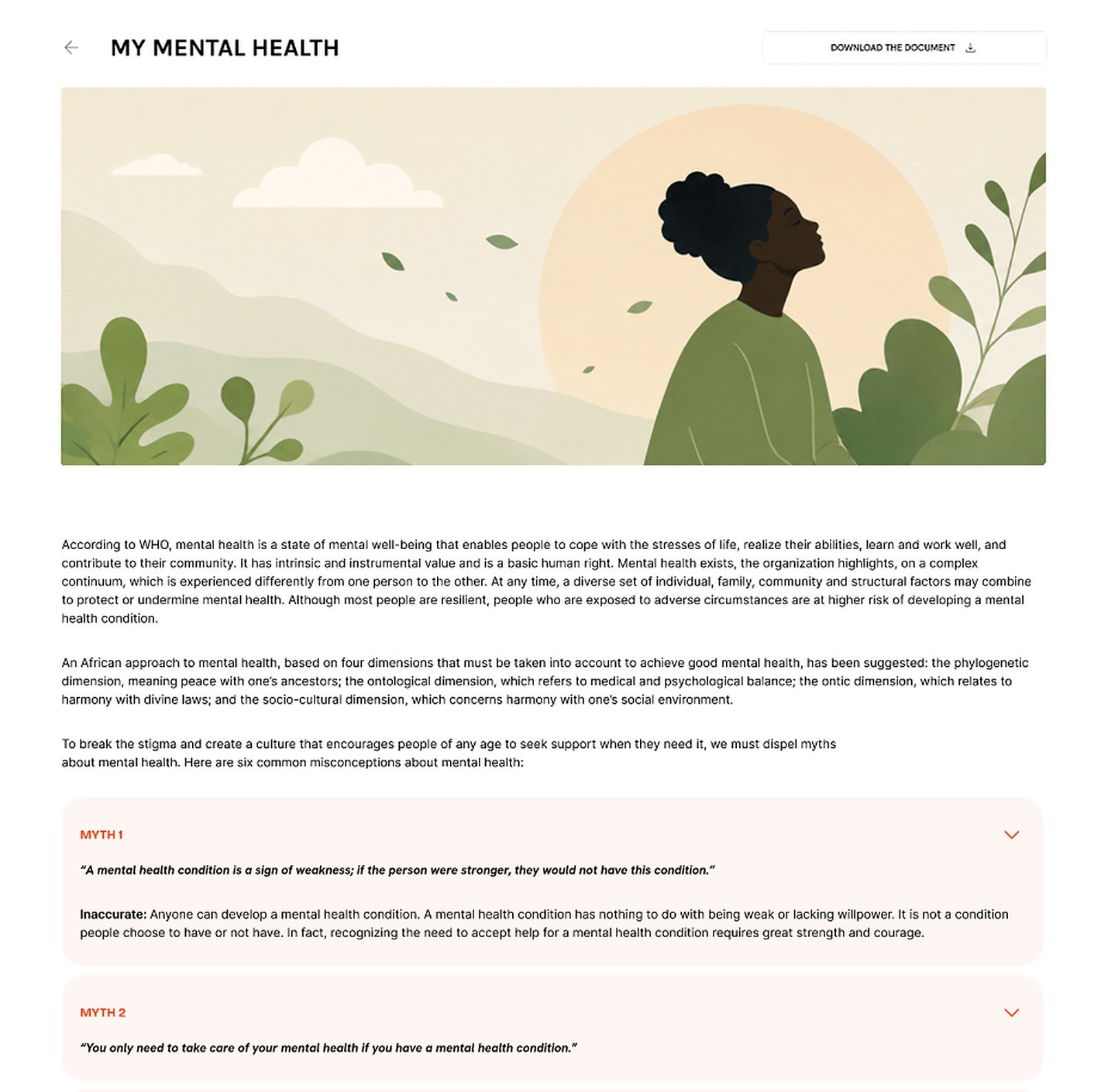
The mental-health myths page: testers didn't immediately realise a myth could be clicked to reveal its reality.
Testing revealed that the platform’s emphasis on student mental health could be communicated more effectively from the outset. This includes clearly highlighting its focus on student mental health and its intended audience: African students studying at African universities.
Support pathways needed clearer expectations
Testing highlighted the importance of explaining what different support options represented and what users could expect when choosing them.
In particular, some labels created expectations that did not fully align with the proposed service model. This led the team to reconsider terminology and the amount of contextual information provided around options for speaking with a counsellor.

The original “Emergency" banner tested with students, before the button was renamed “Helpline.”
For instance, “Emergency Line” was changed to “Helpline” to better reflect the service’s nature. Similarly, “The Black Box” was renamed “Ephemeral Journal” to communicate the purpose of the private journaling feature more clearly.
The broader lesson was that presenting a support option is not enough. Users also need to understand what the service is, how it works, and what to expect when they choose it. The platform had to reflect the diverse levels of comfort students could have with technology and, indeed, with the very topic of mental health.
The purpose of “The black box” needed to be clear
The prototype also explored a feature, initially named “The Black Box,” that would offer students a confidential space to process unsettling and difficult emotions without the need for their experiences to be permanently recorded.
Testing showed that participants did not always interpret the feature’s purpose in the same way, particularly regarding whether submitting something would lead to a response. It also surfaced expectations around privacy, anonymity, and what would happen after information was submitted.
Rather than treating these questions as purely interface issues, the feedback helped the team reconsider how the feature itself should be explained and structured.
6. Turning User Feedback into Design Decisions
The testing phase gave the team a clearer basis for refining the experience before development.
Across the platform, several design principles became increasingly important: use recognisable language, make actions explicit, clarify what users can expect and reduce unnecessary interpretation. These are all common design heuristics, but the Mama_Africa team, who had worked on the initial structure of the platform, consisted of researchers and mental health professionals rather than trained designers.
The collaboration with YUX influenced decisions such as simplifying terminology, strengthening information hierarchy, making the purpose of key pages clearer, and reconsidering how support pathways were labelled and presented.
One of the most significant changes was the introduction of a Help Center, a page that had not been part of the Mama Africa team's initial structure. Testing showed that students could respond differently to the same situation and look for different forms of support. Some wanted to speak with someone directly, others preferred to write, while others were primarily looking for information or advice.
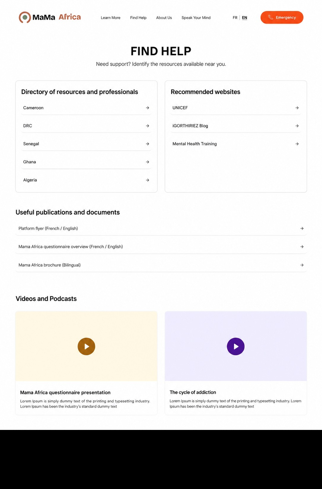
The refined “Find Help” resources page, organised by country - the foundation for the later Help Center concept.
The Help Center was therefore designed to bring these different support options together in one place, making it easier for students to understand what was available and choose the pathway that best matched what they needed at that moment.
The “Resources” page was also refined to make different types of information easier to distinguish and navigate. Testing had shown that participants did not always understand what they would find on the resources page, leading to clearer labels, categories and shortcuts.
These changes illustrate the role usability testing played in the project: not simply confirming an existing design but identifying where the design needed to change before it was built.
7. Designing for Cameroon with future adaptability
While Mama_ Africa research programme spans Senegal, Cameroon, the Democratic Republic of Congo, Algeria and Ghana, the first version of Mama Africa Campus is being developed specifically for students in Cameroon. This meant grounding the initial digital experience in the realities, resources and support pathways available within the Cameroonian context.
Support services, contact information and available resources can differ significantly between locations. Rather than assuming that the same pathways would be relevant everywhere, the design needed to present information that is practical and appropriate for students using the platform in Cameroon.
Testing also reinforced the importance of practical information such as contact details and location-specific resources when presenting support options. At the same time, the visual design aimed to create a calm and approachable environment through the use of soft colours, rounded shapes and gentle visual elements, helping the experience feel less clinical or intimidating
This shaped an experience intended to provide a consistent overall structure while allowing relevant information and support options to reflect the contexts in which the platform will operate.
8. What the UX/UI Phase Delivered
The completed UX/UI phase established the design direction for Mama Africa Campus, translating insights from a research programme into a structured digital experience.
Through UX design, prototyping and usability testing, the team evaluated how participants understood and navigated the platform, and refined key areas including language, information architecture, navigation and the presentation of support pathways.
The outcome of this phase is a refined UX/UI direction that will inform the next stage of implementation: development.
YUX’s UX/UI work is now complete, and Mama Africa Campus has progressed into the development phase. At the time of publication, the platform has not yet been deployed.
9. What We Learned as Researchers and Designers
This project reinforced that translating research findings into a digital product involves more than making them shorter or easier to read.
It requires considering how people will interpret the language, recognise themselves in the information, understand their options and move through an experience when the subject itself may be sensitive.
The usability-testing phase demonstrated the value of examining those assumptions before development. Terminology, labels and interactions that appeared clear from a design perspective were not always interpreted in the same way by participants.
The project also highlighted how significant the unmet need for student mental-health support remains. Available services can be limited, may not operate 24/7 and can involve waiting periods of up to 48 hours, yet students may still be willing to wait because so few alternatives exist.
For us, the key learning was that even relatively small pathways to information, reassurance or human support can matter when access is limited. Mama_ Africa began as a research project, but its evolution into a practical resource shows how research can begin to respond to needs that are much larger than any single platform can solve. We are grateful the Mama_ Africa team has launched this initiative and hope it will be sustained long term, and able to incorporate advanced content and resources for students in Africa.