Agritech - Senegal
Our business challenge
myAgro is an award-winning non-profit social enterprise based in West Africa, that has pioneered a mobile layaway payment model that enables farmers to invest their own funds in high-quality seeds, fertilizer, tools, and training to significantly increase their harvests and income. myAgro works with 115,000 farmers and counting in Africa (Mali, Senegal, & Tanzania). In 2022, myAgro reached out to YUX to bring their product, myAgro Connect, to the next level and conduct user experience (UX) research with their users.
The Outcomes
In order to help myAgro better serve farmers and expand to reach even more farmers in West Africa, we worked with the team to redesign their myAgro Connect and test new features with users. Here is the Human Centered Design approach and outcomes we had:
- Step 1: We hosted an online kick-off workshop and conducted a visit to the myAgro offices in Thies, Senegal to meet with managers and understand their strategic objectives and success criteria.
- Step 2: We conducted field research in Méouane village and Thilmakha village, and held in-depth interviews with myAgro field agents and farmers. We asked open-ended questions to understand their needs and ran usability tests on the existing myAgro products.
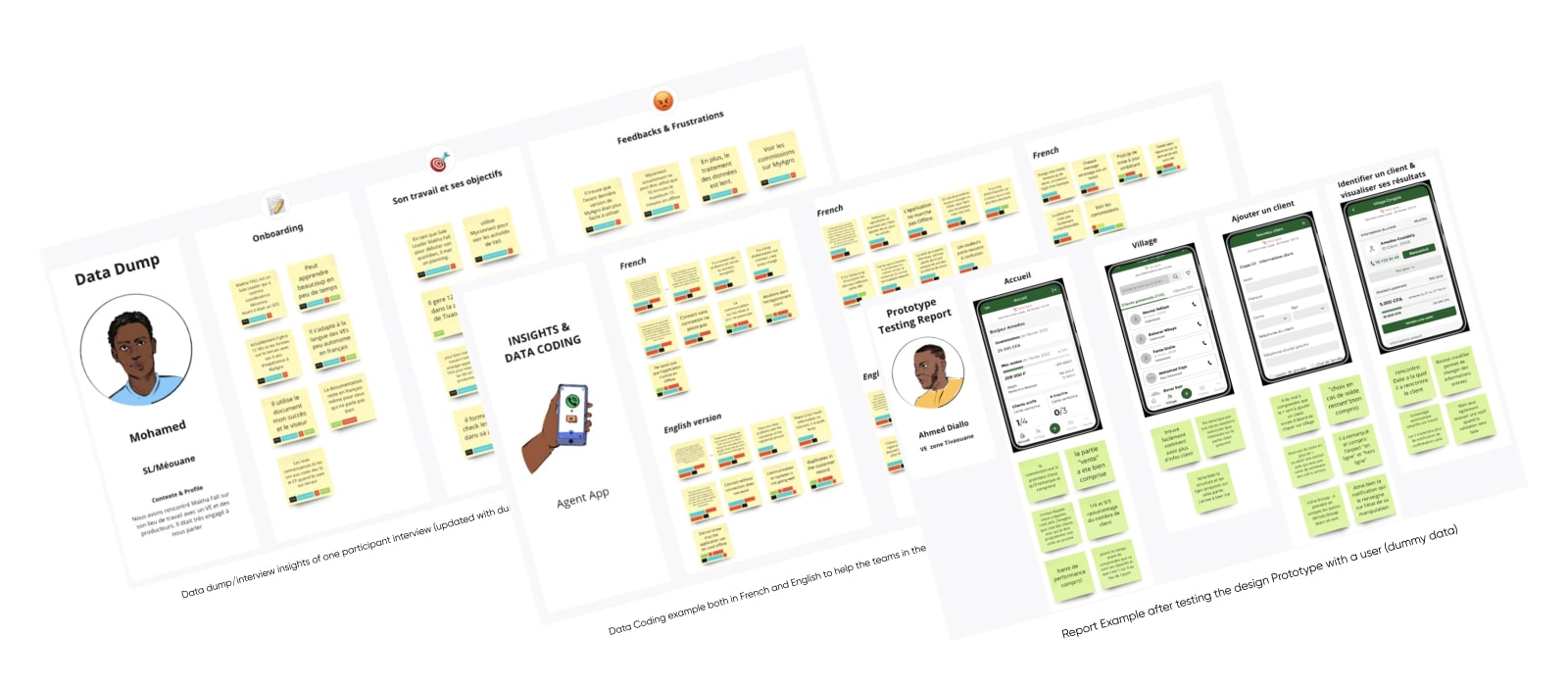
- Step 3: We facilitate a Product Iteration Workshop in which we coded the insights with various tags, listed pain points and ideated on potential new features and modifications. Then we prioritized the opportunities with the tech team and product managers. All deliverables were made both in French and English to enable the larger myAgro team, spread all over the world, to take part in it.
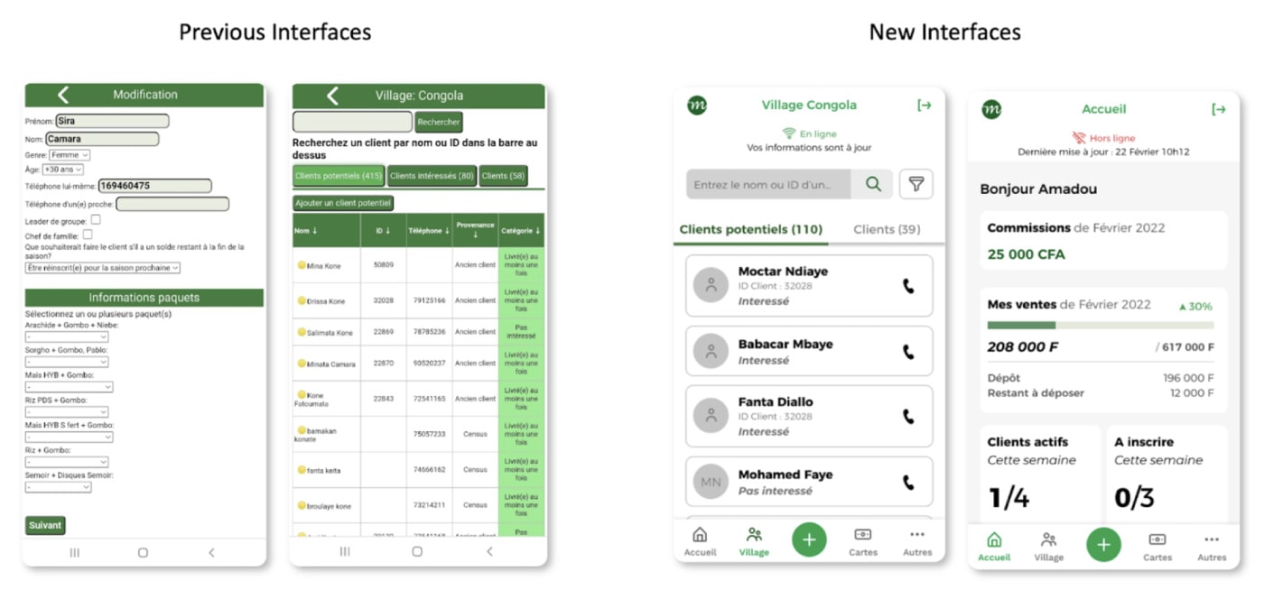
- Step 4: We designed the agent application from a user experience and a user interface perspective and held several feedback sessions with the myAgro product and tech team to validate feasibility, producing several key screens and a new UI Kit / design system.
- Step 5: We circled back to farmers and agents to test the design prototype. User researchers delivered a comprehensive test report with UX recommendations.
- Step 6: We iterated on the UX and UI design based on the tests and finally, we handed over the design elements to the software developers.
This redesigned version of myAgro Connect will help the agents go much faster in their daily tasks but most importantly have a much clearer visibility on their performance and on the needs of farmers they support. Overall, like we did with myAgro, we love when we have the chance not only to do the research and design with real users, but also to build the UX capacity of our partners for a more sustainable and long term impact of our work.
Our Design Approach
Some outputs

